Branding Your Online Community: 6 Customizations to Make It Uniquely Yours (with Examples)
Your online community should feel like a natural extension of your brand, with every touchpoint reflecting the company’s identity. From the visuals — colors, logos, fonts — to the tone of your messaging, maintaining consistency across your community is what makes members feel connected to the same brand they know and trust.
Once you’ve defined your community’s core brand elements, you want to prominently display them in the most visible, high-impact areas of your community platform. These are the spaces where members will interact with your brand the most, and where consistency can make the strongest impression. Here’s how you can customize your community to make it truly your own.
6 Key Places to Infuse Your Brand Into Your Online Community
1. Homepage
Your community’s homepage is often the primary touchpoint for new and returning members. However, some visitors may also land directly on a discussion page via search results, which is why maintaining brand consistency across your entire community is essential.
Every detail—from logo placement and color scheme to the welcome message and overall tone—should work together to set the right impression, communicate your community’s purpose, and create a cohesive experience.
The hero banner—the prominent area just below the navigation bar—is key to achieving this. It grabs attention and immediately tells visitors what your community is all about.
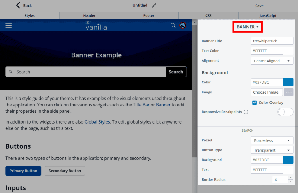
With Vanilla, you have full control over the hero banner. Customize every detail, from the title text and descriptions to fonts, alignment, and spacing. You can also tailor the background using colors, images, or overlays for optimal readability. The search bar is just as flexible, with options to adjust its size, borders, alignment, and more. Plus, the banner adapts dynamically to different user segments, allowing you to personalize content by role or user status, whether they’re guests or signed-in members.

Image: Higher Logic Vanilla’s customizable hero banner
Custom page layouts
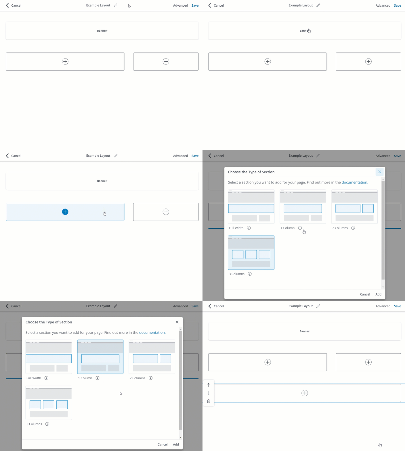
Beyond the hero banner, Vanilla’s Layout Editor lets you create custom page layouts tailored to your brand. Admins can organize page content to spotlight key areas — like featured content, upcoming events, or new product releases — in a way that aligns with your organization’s priorities.

Image: Higher Logic Vanilla’s customizable page sections via its Layout Editor. Sections are containers that hold your page content and widgets.
The homepage experience can also be personalized to meet users where they are in their journey. Whether you’re looking to increase engagement, nurture new members, or support advanced users, the layout can be designed to drive the behaviors that matter most to your business.
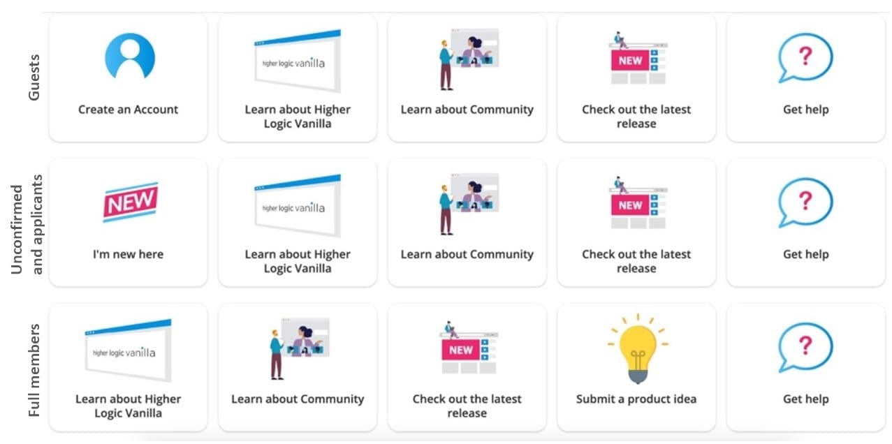
For instance, with Vanilla’s dynamic category widget, you can tailor category visibility based on specific community roles. You could target different types of users such as guests, unconfirmed users (awaiting email confirmation), applicants (pending moderator approval), and full members.
In the example below, guests may see a prompt encouraging them to create an account, directing them to the registration page. Unconfirmed users and applicants could be guided to an “I’m new here” section, while regular members might have access to features like a “Submit a Product Idea” button.

But great UX is more than just functionality; it’s about creating an aesthetically pleasing space that mirrors your brand. Whether your brand is sleek and modern or fun and vibrant, Vanilla’s Layout Editor gives you the flexibility to design a community that feels authentic and intuitive for your users.
2. Discussion threads and posts
Most of the engagement in your community happens in discussion threads and member posts, making them prime opportunities to showcase your brand. To maintain consistency in messaging and tone, implement clear community guidelines that align with your brand’s values. This way, members interactions and contributions reflect the culture you’re working to build.
Alongside clear guidelines, you can reinforce your brand identity through subtle details. Take Vanilla customer, Crisis Text Line, for example, a non-profit providing free, 24/7 text-based mental health support. They personalized their community’s emoji reactions, replacing the standard thumbs-up with symbols like hearts to foster a more supportive and compassionate environment. This thoughtful touch ensured the interactions reflected the organization’s values and created a space that truly resonated with their community’s unique needs.
3. Domain
Using a custom domain is a smart move for keeping your community tied to your brand. Hosting it on a subdomain, like https://community.example.com, creates a consistent experience for members while subtly reinforcing your brand’s presence. It’s a small detail, but it makes everything feel more connected.
Vanilla takes care of the technical side by automatically providing SSL certificates for both Vanilla URLs and custom domains, ensuring your community is secure. And when it comes to SEO for your community, there’s no downside to using a subdomain. Search engines treat subdomains as part of your main domain. This means you can safely transition to a subdomain-based URL without worrying about SEO penalties, even if your site previously used subfolders (e.g., example.com/community).
4. Header and footer
A consistent header and footer go a long way in creating a seamless experience across your web presence. By incorporating your site’s existing header and footer into your community, you create a cohesive branded environment, ensuring users feel like they’re navigating within the same space as they move between your main site and the community.
With Vanilla, you can fully customize your community’s navigation bar and footer. Adjust the background and text colors, tweak the height, border, and logo alignment, and easily manage the spacing of your links. Reordering or nesting navigation links is as simple as dragging and dropping.
5. Member onboarding and emails
Your community’s branding should be woven into every touchpoint, from the moment new members join to ongoing engagement. Onboarding is your first opportunity to introduce not just the community itself but also the tone, values, and visual identity that define your brand. Incorporate your logo, colors, and messaging into welcome emails and ensure that every interaction reflects the core essence of your brand.
But it doesn’t stop there. Branded communications, like weekly digests, keep the momentum going. These updates should showcase key discussions, resources, and events while reinforcing your brand presence.
6. Accessibility
Part of branding is ensuring that your community is accessible to everyone, regardless of device or ability. A responsive page layout that adapts seamlessly to mobile devices and meets accessibility standards sends a clear message about your brand’s inclusivity and user-centric values.
At Vanilla, we’ve implemented measures to ensure our platform meets accessibility requirements. These can serve as a foundation for building out your own accessibility strategy:
- Our default user interface is primarily text-based and high-contrast.
- Our interface is keyboard friendly.
- We limit the use of colors, images, and symbols as navigation aids and as primary content.
- We use modern HTML5 markup and accessible forms.
Want to make your content more accessible? Here are some accessibility dos and don’ts when it comes to things like formatting, contrast, images, and more.
Examples of well-branded online communities
Explore how other brands have brought these principles to life. These standout examples of community branding demonstrate how everything, from accessibility to design, can be seamlessly aligned with your brand identity, all while enhancing the overall user experience.
1. Apartment Therapy
2. Bluebeam
3. Reckon
Want more community branding inspiration? Take a look at Vanilla’s Customer Showcase and see how you can make your community feel authentically yours.


