Getting Insights From Member Data: 3 Steps to Ensure You Can Trust Your Results
You have your member data at your fingertips. Now what? It’s time to validate your data to ensure accuracy, clarity, real insights, and results you can trust.

Being data-driven helps organizations gain real insights and make decisions based on member behaviors and trends. Instead of basing decisions on “the way you’ve always done things,” or based on one staff person’s opinion, data empowers you to set strategies that align with what actually matters to members and sparks engagement. Sounds great, right?
But when you’re doing data analysis to get insights from your data, how do you know you can trust your data?
One important first step for a successful data analysis project is using a member data framework to help guide your data projects. This framework helps keep everyone involved in the project on the same page. It also makes you ask yourself important questions to figure out if you’re looking at data that actually matters.
But when it comes to the data itself, an important next step is validating your data to make sure it’s accurate, clear, and actionable. In this article, we’ll walk you through how to do that!
The Importance of Knowing Your Data
You have a lot of data on your members – and you should use it! But when you’re getting insights from data, it’s important to understand how reliable the data is.
The more mission-critical the decision you’re trying to make, the more important it is to validate the data you’re using. And it’s a lot easier to evaluate the data you have access to BEFORE you start – it’s much worse to lose trust in your data AFTER you’ve done all the work to collect and analyze it.
Let’s say, for example, that you want to get insights from your data to make a decision about where to host your organization’s major events. You might decide to exploring how your members are distributed around the country. Sounds like a logical plan, right?
But in order to trust that your data will give you real insights, you’d want to know (1) what percentage of members actually have their location filled out in their accounts, and (2) where that location information came from and how often it’s updated (e.g. is a member likely to have input that information years ago and never updated it? Has it been updated since many people started working remotely?).
For clarity’s sake, internally, you’d also want to ensure that whoever you’re working with to pull the data understands if there’s any refinement to the data (e.g. maybe you’d want to exclude any student members because they’re ineligible to attend the event).
Here are some tips to help get you started:
- Consider the level of accuracy you need for the given purpose (e.g. if you’re making a budgetary decision, or other major decision, you may want highly accurate information; if the stakes are lower, it might be fine if the data is mildly inaccurate)
- Make sure you include time for data validation and evaluation in your project timeline and set expectations with the team. It takes time to review your data and see if anything is amiss, but we promise it will take LONGER if you find out after you do a bunch of work that your data was incomplete or wrong.
- Document the results of your data review and validation – this could help you save time next time because you’ll remember your process.
3 Steps for Validating and Using Your Data
To get insights from your data and be able to use those insights to take action, there are three areas you can think about as you evaluate your data to ensure that the insights you get from that data are trustworthy and meet your standards.

Step #1: Identify Data Types
First, you need to know the type(s) of data you’re working with.
There are different ways you can collect data – especially if you have a mix of platforms where you store it. When you’re working with larger data sets, trying to identify trends, it’s helpful if your data is standardized.
The main forms of data are:
- Categorical: A list of potential values from a prescribed set. For example, this could be a value like, “Member,” “Lapsed,” or “Non-Member.”
- Date: A period of time. For example, this could be “2020” to indicate their first year of membership.
- Numeric: A percentage, number, or currency. This has a lot more flexibility, but can be something like “$250” for lifetime value.
- Free-form: Open-ended text based on notes, an intake form, or member feedback.
- True/False: Sometimes called a Boolean structure, this is essentially a Yes/No question that your data can answer, like “Subscribed” or “Unsubscribed” to marketing emails, for example.
Why does it help to know what type of data you have?
Let’s say when members choose not to renew their membership, you send them an open-ended survey to share why they’re not renewing. While this may yield interesting anecdotal results, it would be hard to combine the responses from multiple lapsed members because their responses are free-form. So you might decide to adjust, and start providing a member exit survey instead, with specific questions and categorical answers.
That’s not to say free-form data doesn’t have it’s place – sometimes you’re in more of an information-collecting stage, and you may not be ready to provide set categories because you don’t know what those categories should be yet.
But when it’s time to analyze your data, you need data points that can be aggregated. And there are some data points you wouldn’t want in certain formats (e.g. you wouldn’t want to use a free-form data type for dates because different people might format their dates differently).
Consider the following questions:
- Is similar data in a similar format when I pull it from my organization’s different platforms
- Do I have a way to match data points (e.g. a member number that coincides with each individual member so you can align data you have about them in your database with data in your marketing platform or online community).
- Does the format this data currently takes align with how I want to use it?
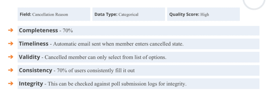
Step #2: Determine Data Quality
Once you know what type of data is available, you can begin to assess the quality of the data. Like the example from earlier, it would be great to use information on WHERE your members are located to decide where to host a major event. But if you’re not sure if that information is correct, then you might not want to use it.
Evaluate your data based on these criteria:
- Completeness: How much data do you have? Is it complete for every field you’re looking at?
- Timeliness: How recent is this data? Have you made major changes to your association since the data was collected? How are you collecting the data in the first place?
- Validity: How does a member interact with this data? What options exist, or is it free-form?
- Consistency: How often is this data point used and filled out? How relevant is this data point to the overall question?
- Integrity: How can you double-check to make sure this data is accurate?
For every type of data, document your validation methods with a template like this one.
Step #3: Use Aggregation Methods
Once you know what type of data you have and what quality you’re working with, it’s time to identify if there are any outlying data points in your data set that might skew your data. You can do this by examining the central data tendency, frequency distribution, and measurements of spread.
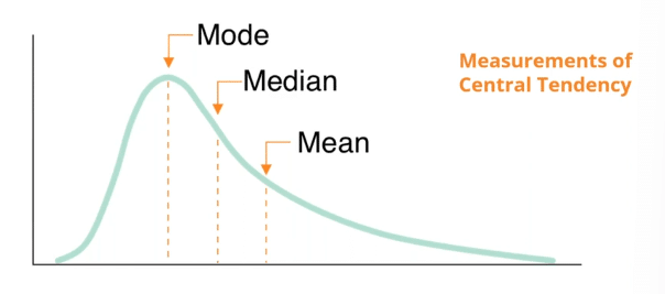
Central data tendency
Measuring the central tendency of your data is a fancy way of saying “Where is most of the data in your data set?” It helps you understand the central or typical value in your dataset, often using measures like the mean, median, or mode.
-
- Mean: Synonym for average. You can calculate the mean by taking the sum of all of the values in the data set and dividing by the number of the data set.
- Median: Refers to the middle. If you were to line up every single value from left to right, the median would be the one directly in the middle.
- Mode: Most frequently occurring value in the data set.
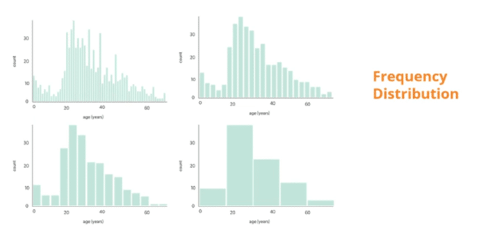
Frequency distribution
Fequency distribution shows you how spread out your data set is, often through a visualization called a histogram. You organize data by grouping it into intervals or categories, showing how often each value or range of values occurs. This provides a visual representation of data distribution in buckets.
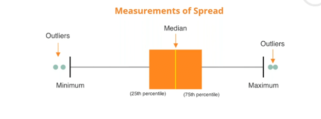
Measurements of spread
Measurements of spread gives you an idea of the range of values you’re working with, including the minimum, maximum, and any outliers. Often visualized through box-and-whisker-plots.
Your Data is a Great Resource
Ultimately, every association is different. It’s great to hear about benchmarks and best practices for context in your wider industry, but when it comes to answering questions about your association specifically, the best place to find answers is within your own data.
You can use it to understand what’s performing well, what’s not, and what you need to change.
When you have a healthy understanding of the accuracy, quality, and limitations of your data, you’re better prepared to get reliable insights from it.
Related Resources
Keep Learning About How to Use Your Member Data

Your Online Community is a Data Goldmine
Build vital connections between your customers, members, and employees. Learn how to manage and take action on all your community...
Read More
How to Use Your Data to Be Member-Centric
Leveraging your member data to increase engagement is a combination of knowing what to use your data FOR and knowing...
Read More
A 5-Step Framework for Successful Member Data Projects
85% of data analysis projects fail due to unclear objectives and poor data quality. Learn how to ensure your data...
Read MoreThis blog post was originally published in 2021 based on insights from our webinar series with Wicket and CSAE titled “Let’s Talk About Member Data.” It has since been reviewed and revised for accuracy and relevancy.